Photo credit
Year
2012
Background
Jotun, one of the world’s leading decorative paints brand, simplifies the color selection process. This data visualization is the result of colour statistics extracted from Pinterest which is a rapidly growing content sharing platform effecting millions of consumers’ decoration decisions.
Concept
The data visualization is showing peoples relationship between colour and space in specific household areas. The concept for the visualization is to design the data of the survey by using the two key elements, colour and space, as tool and canvas to thereby establish a familiar relation between the user and the data. The diagrams use the context of the data to design the data itself and that allows the diagrams to show more layers of information about the statistics.
The project has been featured on the Fast Company design blog
Read more: http://www.behance.net/gallery/Colour-and-Space-by-Jotun/6509563
***
Join the next color course.
 Would you like to embark on a colour adventure, play with mixed media, and learn about the 7 levels of energy?
Through color audios and videos, we explore each colour and the associated level of energy. We will explore and play through:
- colour vision journaling/colour stories
- mixed media, {paint, print, collage} and
- photography
learn more here.
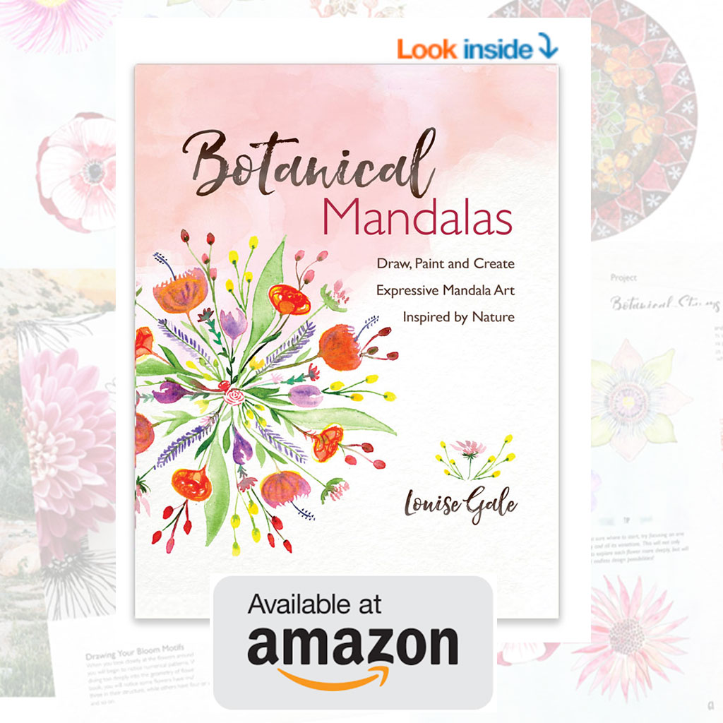
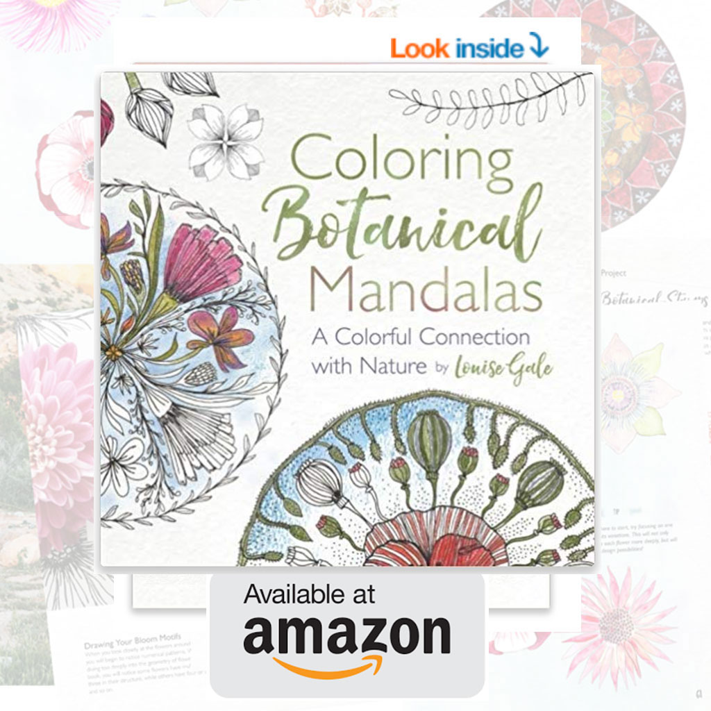
 Hi, I'm Louise and thank you so much for visiting me here. I am a mixed media artist, who is passionate about combining the healing energy of nature and color with the meditative process of mandala making